Voter outreach graphics
A free software platform and templates for designing appealing election graphics.

What you’ll need
- Computer with internet access
- Communication goals that you can reach through graphics
- Relevant election data or information that you want to share with an audience
Getting Started
1. Before you design
Making graphics part of your overall outreach program
Graphics catch the eye and convey information quickly and easily. But graphics have downsides, too.
Graphics can be professional — but also impersonal.
Graphics can look slick — but also generic.
This means you should use graphics alongside other kinds of visuals for the best impact. On social media, images of people and places tend to be especially popular.
As a general rule, you should share a diversity of content and track your engagement results. Over time, you’ll have data that you can use to guide your outreach program.
Setting goals and selecting information
Before you begin designing a visual, have a communication goal in mind and election data or information to support that goal.
First, think about your audience and your desired outcome for that audience.
Then, get relevant data or information that you’ll use to lead your audience to your outcome.
For example, if your goal is to inform voters about the convenience of voting by mail, use data showing that more and more voters in your area are using that method. Maybe a pie chart — or a graph — could help illustrate that change.
2. Making graphics accessible
Remember: accessibility is critical when you are publishing government information. So, as you work with your graphics, be mindful about how you’ll make them usable for blind and low-vision people who may not be able to see them.
When you are posting visuals on your website, via social media, or in an email newsletter, you must include alt text, just as you would for any image.
However, because graphics can communicate complex ideas, your alt text might be more appropriate as a long description.
Remember that you can include a paragraph or two of text with your infographic to help everyone understand the main takeaways of the visual. Think of this accompanying text as a way to both include the textual information from the visual and also include highlights of the key relationships in your data.
You may also want to include a link to the table of your raw data that was used to make the graphic.
Elements to consider when making your visuals accessible:
- Write a text description of the infographic.
- Write in plain language whenever possible.
- Use contrasting colors and easy-to-read fonts.
It’s true: making infographics accessible can be hard. The way to make it easier is to do simple things that might help everyone.
Want to learn more about accessible graphics? Check out this article and short video on making complex images accessible.
3. Canva overview
Canva is free, easy-to-use design software. You can use templates and design elements to create visuals for the web and for print, including social media posts and flyers for your election office.
Let’s walk through the basics of using Canva.
Begin by going to www.canva.com. If you don’t have an account, take a moment to create one.
Creating a design
When you’re ready, start the design process by going to the top left and clicking Create a design. You can choose from a number of different formats for your design.
Select the type of graphic based on where you want to publish it. Canva will size the graphic according to the specifications of the specific platform.
Searching for design elements
The search function is a great place to begin. It will help you find templates, photos, and graphics to fit your design concept. You can search for terms like “vote,” “community,” “flag,” and so on to find relevant design elements.
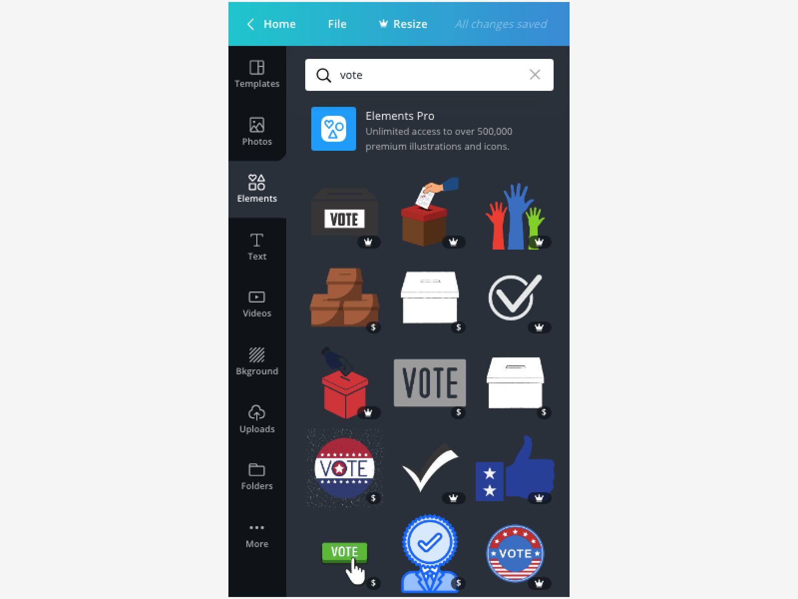
When you start to use Canva, you’ll notice that some design elements cost money or require a Canva Pro account. You may choose to spend money or create an account, but you don’t need to. There are plenty of free elements.
Templates
Canva provides many templates that you can edit and customize. Once you select a template, you remove existing elements and text and add new ones.
Elements
Canva provides elements that you can add to your design. Elements include grids, shapes, lines, illustrations, icons, and more. Once you add an element, you can move it around your design and resize it.
Text
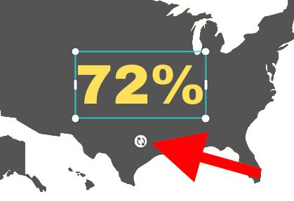
Canva has many text options for your design. Click on a style that you like and it will move to your workspace. Even after the text is added, you can change the font and color in the editing menu.

Background
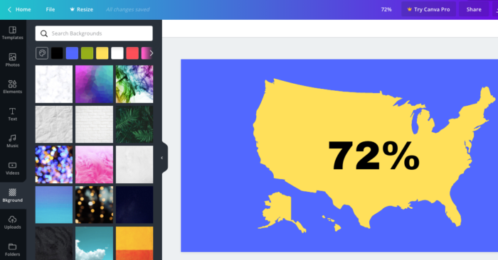
There are plenty of background options in Canva. You can also select the color squares on the left menu to change the color of your graphic background.
Tip: you can change the transparency of any element by clicking on the element, then clicking on the “checker board” icon on the far right of the top menu.
Uploads
You can upload images to use in your design. We encourage you to upload your county seal, election office logo, and visuals from the Civic Icons and Images collection to your Canva account. Once a file is uploaded, you can add it to your graphic by clicking it.
Naming and saving your design
As you make progress on your graphic, show your design some love by giving it a name. In the upper right corner, click in the name box and type a new name.
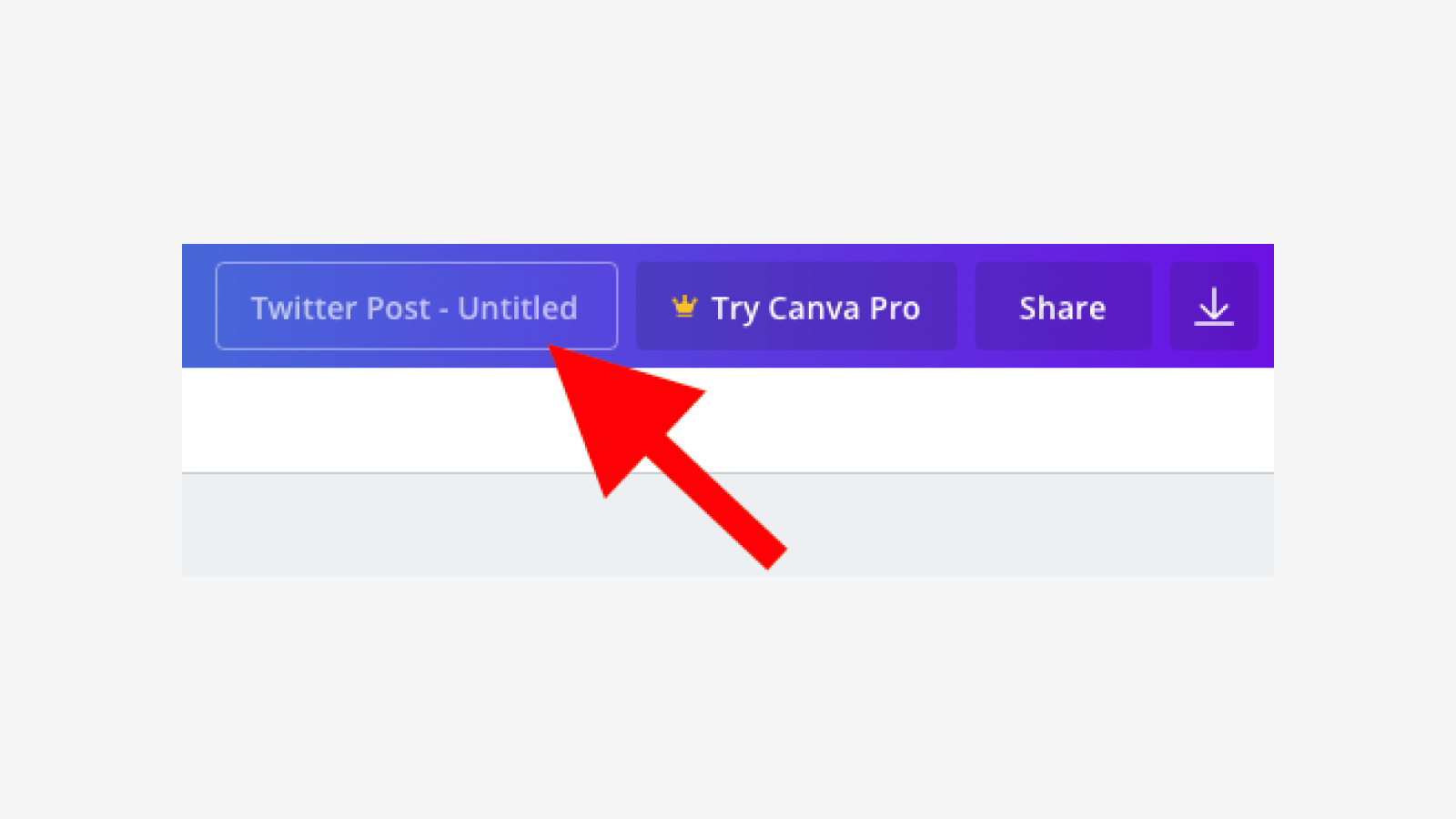
And although Canva saves your design automatically, you can make sure your latest version is saved by going to File and selecting Save.
Download
When you’re ready to publish your design, in the upper right corner, click the Share button and scroll down to select Download. Select the format based on the type of design you created. PNG is usually a good choice for materials distributed online. PDFs are good for printing.
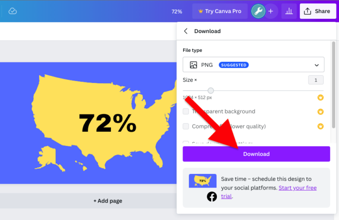
After you download your design, you can share it via your social media accounts, upload it to your website, or send it to the printer. You can treat it like any other image, but keep the graphic’s dimensions in mind to avoid unwanted cropping or distortion.
4. Best practices for good design
Now that you are familiar with some of Canva’s basic features, let’s talk about design.
What makes a good design? What makes a bad one?
To put it simply, a good design incorporates one or more of the principles of design. They are: contrast, repetition, alignment, and proximity.
Contrast
Contrast emphasizes what is important. It adds interest by not making every element within a design look exactly the same. Contrast can make something eye catching and memorable.
You can apply the principle of contrast with:
- Shapes: if your design already uses squares and rectangles, try adding a circle
- Fonts: for emphasis, use two fonts that complement each other but are noticeably different
- Colors: apply more than one color or color scheme

Repetition
Repetition is achieved by repeating elements throughout a design. It creates consistency and shows how different things are related.
You can apply the principle of repetition with:
- Fonts: be consistent, and reuse textual elements. Use a maximum of 3 fonts in any design.
- Colors: limit the number of colors and patterns you use, and repeat them to make the design cohere.
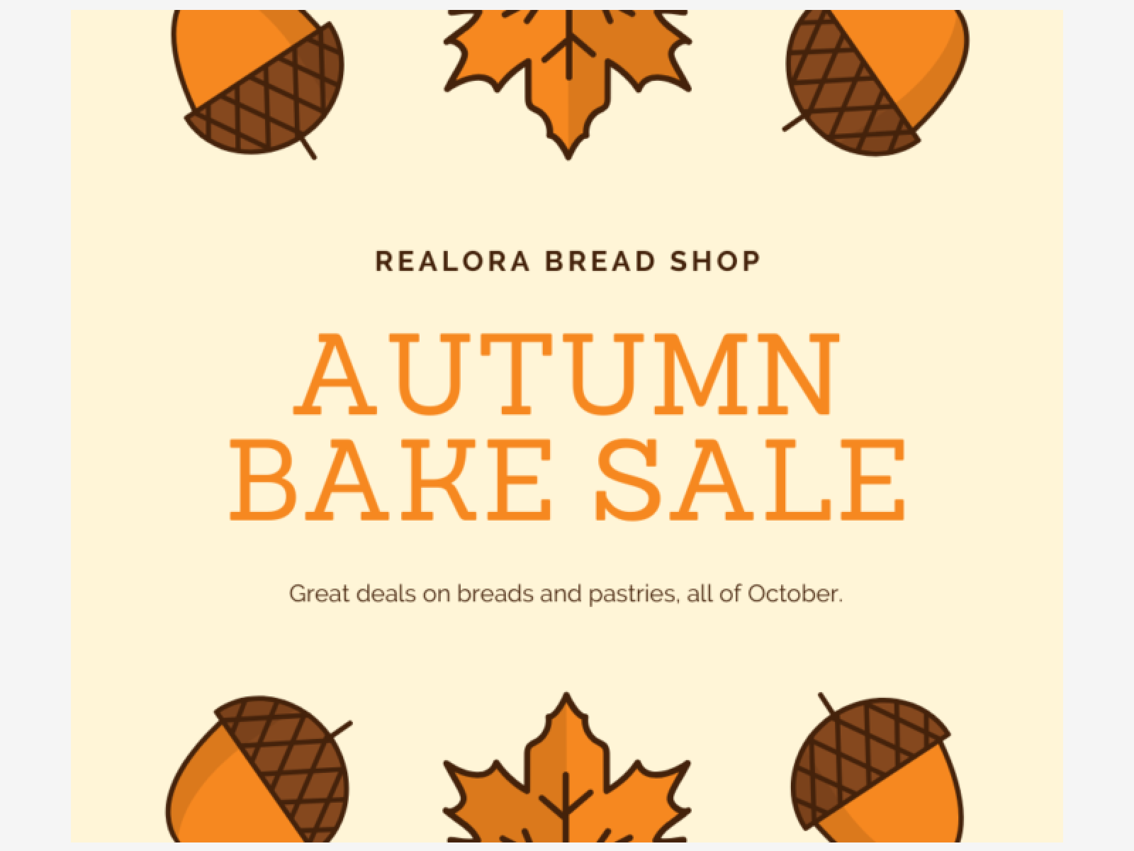
- Images: repeat images, icons, and graphics for a compelling effect. If you are using a photo filter, use the same filter for every photo.
Alignment
Alignment involves connecting every element via an invisible line. When you think about alignment, imagine the justified edges of your content.
Aligning all of your elements will give your design a sense of order. Be sure to mind the margins. If it’s important for the audience see the whole element, it should never actually touch the edges.
You can apply the principle of alignment with:
- Vertical axis: align to the top, center, or bottom
- Horizontal axis: align to the left, center, or right
Tip: Use the “rule of thirds” or a grid to help balance your photos.

Proximity
Proximity is achieved by grouping related things together. It forms visual units that are easy to understand.
Empty space, or white space, is your friend. By creating space in your design, you draw attention to clusters of elements and create visual cues for your readers.
You can apply the principle of proximity with:
- Text: group textual elements into categories or focus the reader’s attention on a particular message
- Images: organize images that are related to each other

At this point, since you have a basis for designing graphics, you can either create visuals from scratch or work with our sample election graphics templates.
Using the toolUsing the Tool
1. Sample templates
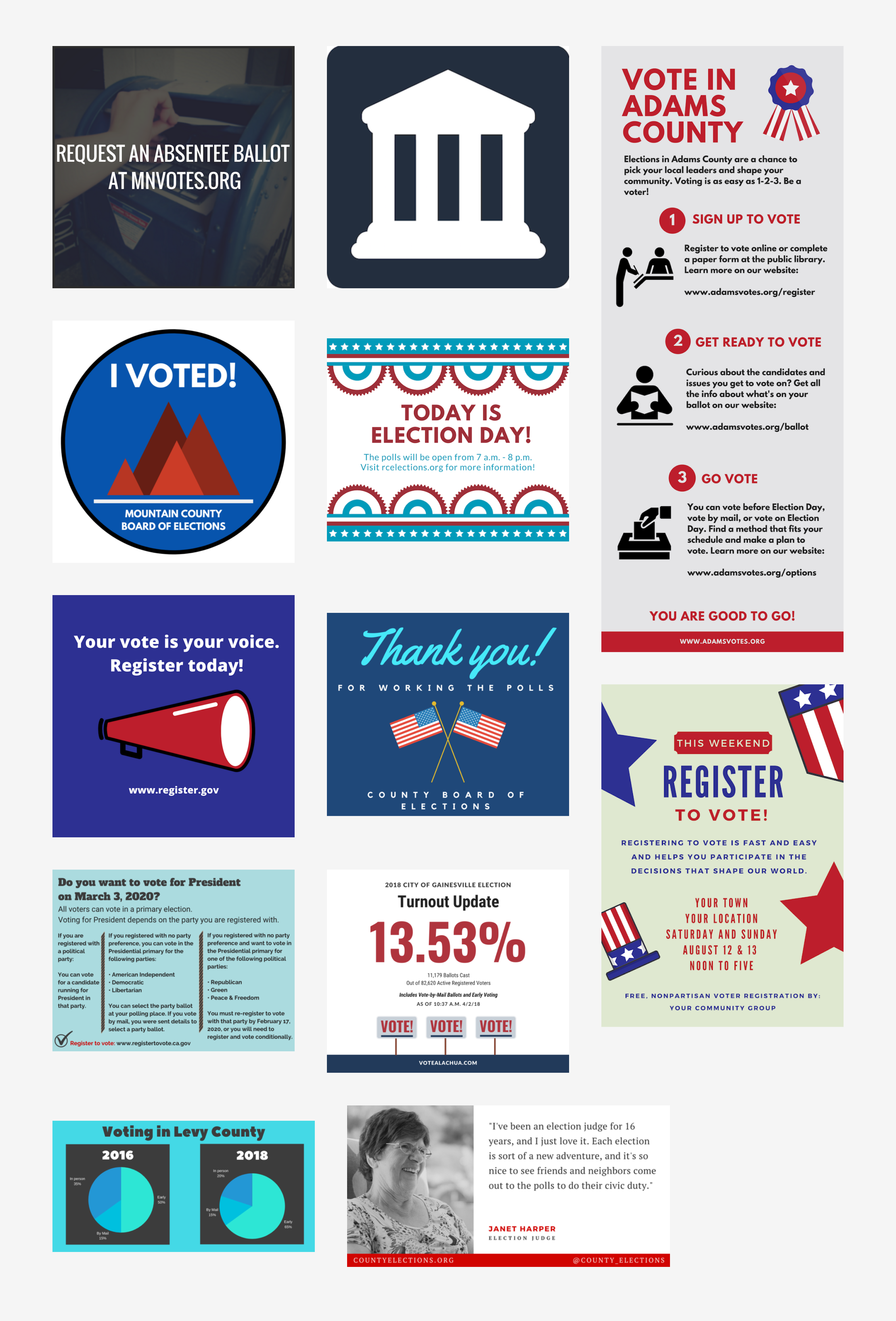
The following sample templates were created using Canva. The instructions below the images will walk you through the steps of how to receive editable versions of these templates.
2. How to request Templates
The templates that you will receive have placeholder text and images that you can edit using Canva. Here’s the process to get the templates and begin editing them:
- Submit a request
Notify our team that you would like to receive the graphics templates by submitting the request form. - Receive and open an email from us
Once we receive your request, we will share the graphics with you with an email that will include links to the templates and instructions for using them. - Copy the template
It’s a good idea to make a copy of each template so that, if you make a mistake, you’ll still have the original version to return to. Once you’re looking at the template on the Canva website, go to the upper left corner of the screen, click File, and select Make a copy. You can now rename your new copy, if you like.
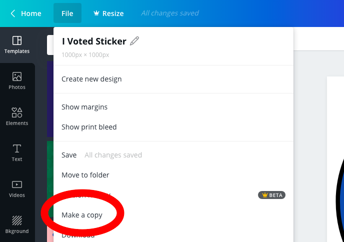
Using your Canva skills you can now edit the template to include text, fonts, colors, and information that is specific to your election office and brand. Edit your new copy, and the original will still be there if you need it.
Once you refine the design to suit your needs, you can download and share the graphic with your audience.
Remember to include a text description with your graphic.
Below is the text description that would be included with the Vote in Adams County graphic:
Vote in Adams County.
Elections in Adams County are a chance to pick your local leaders and shape your community. Voting is as easy as 1-2-3. Be a voter!
- Sign up to vote. Register to vote online or complete a paper form at the public library. Learn more on our website: adamsvotes.org/register.
- Get ready to vote. Curious about the candidates and issues you get to vote on? Get all the info about what’s on your ballot on our website: adamsvotes.org/ballot.
- Go vote. You can vote before Election Day, vote by mail, or vote on Election Day. Find a method that fits your schedule and make a plan to vote. Learn more on our website: adamsvotes.org/options
You are good to go! Visit www.adamsvotes.org for more info.
Remember to choose the appropriate format based on if you are publishing the design online (JPG or PNG) or printing the design (PDF).
ResourcesResources
Making effective visuals for everyone in your audience requires continued learning and practice. Check out the following resources to advance your design skills:


